
Rebranding is a difficult process. As our Sales Expert Zak Edwards laid out in his recent LinkedIn article, changing your companies visual identity requires extensive planning and revision. So, what happens when it goes wrong? How does a business correct course and rebuild goodwill with their customer base? In this article, Wildfire Marketing will highlight some well-known remarketing blunders. We’ll then use our expert Digital Marketing knowledge to provide some key tips for rebranding recovery!
2010: GAP and Walking it Back
This is such a well-known rebranding blunder we saw fit to use it as a pun in our title. The Gap logo is truly iconic. Except, of course, for a small period around 2010 where it really wasn’t…
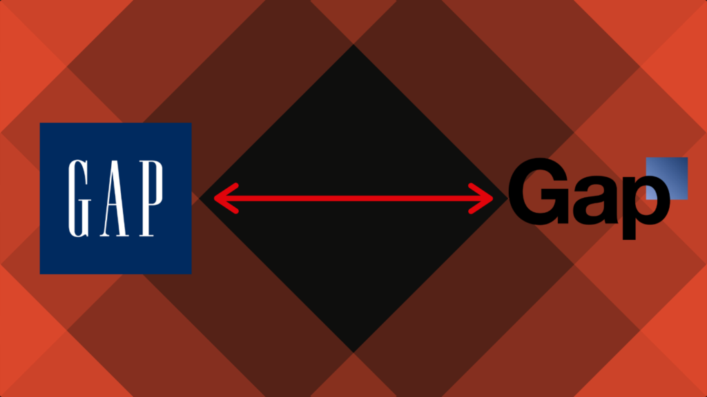
Bland, uninspired, forgettable – these were just a few of the words critics and customers alike were throwing at GAP. This was rather close to the holiday season, an important sales period for any clothing brand. So, what does one of the biggest clothing companies do when they need a quick solution to a potential sales nightmare? Simple.
They walked it back.
When customers are truly attached to your brand, the age-old mantra of “If it ain’t broke, don’t fix it” should be running through your head on loop. Rebranding is supposed to boost sales. If sales are solid and you only stand to lose on your current rebranding course, don’t be afraid to give the customer what they want.
2006-2016: Mastercard Gives it another Go
Mastering most skills takes time (pun intended). Rebranding is a skill that definitely falls under that criteria. Working with an agency, creating the right brief; every step of rebranding takes time and skill. Mastercard learnt this the hard way in 2006 when they invested millions into a logo that really didn’t take off.

The iconic Venn diagram in striking red and yellow was obscured by a strange blob. Not only was it disproportionately large, but it also left a gradient in its wake that made the design barely comprehensible. Mastercard, much like GAP, quickly resigned this maligned design, leaving it on official documents only.
You’d think after this Mastercard would never touch rebranding again, leaving their logo to fall further and further out of style. Instead, they learnt from their mistakes and entrusted esteemed design agency Pentagram to try again in 2016.
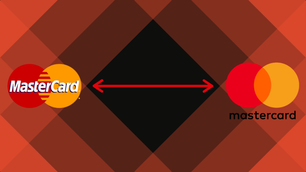
Clean, seamless and timeless. The takeaway from this is clear to see. When rebranding fails, learn. The harshest lessons create the greatest results.
2018: Leeds United FC and Subtlety
We had to mention this one, we are the number one SEO Agency in Leeds after all. We’ve even worked with Kalvin Phillips on his logo. Whilst that was a fairly seamless rebranding, the one LUFC tried to pull in 2018 was misinformed at best. Leeds has been no stranger to rebranding over the years, but the current logo s something Leeds fans are proud to have been wearing since the early ’90s. With this context in mind, you can see why this idea didn’t go over well.
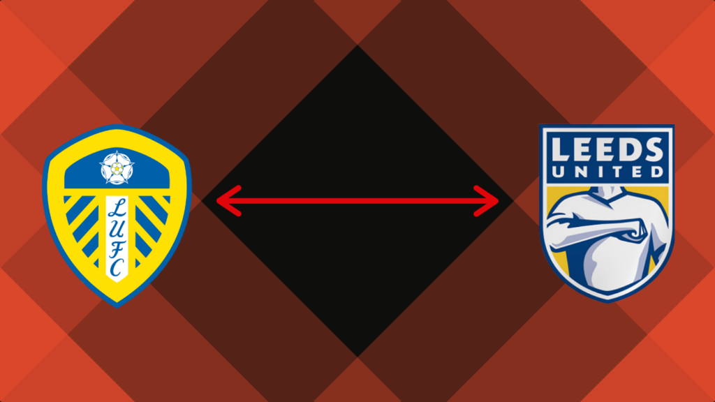
“Affectionately” known as the ‘Gaviscon’ logo, this design was considered so generic and without that Leeds flair that a petition to remove it gathered over 77,000 signatures. With that kind of backlash, you can imagine how quickly this design was buried.
Whilst the logo was scrapped, the rebranding wasn’t. subtle changes to colours, an overall flattening of design. LUFC was made modern not with a gaudy new look – but with minuscule design changes that ensure both legacy and modernity are maintained. This is best exemplified in their 100th-anniversary logo design.
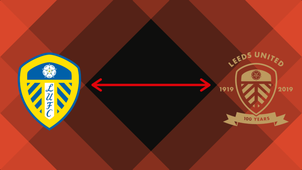
When one aspect of rebranding fails, don’t throw the whole effort away. Cut the fat and keep what works, your customers will appreciate it. We hope this guide has shown you and your business how to effectively recover from rebranding mistakes in the future. Want to avoid rebranding mistakes in general? Just the number one SEO agency in Leeds – Wildfire Marketing. Contact us today to learn what we can do to reignite your Digital Marketing